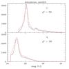
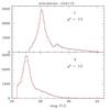
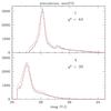
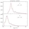
Fig. 11
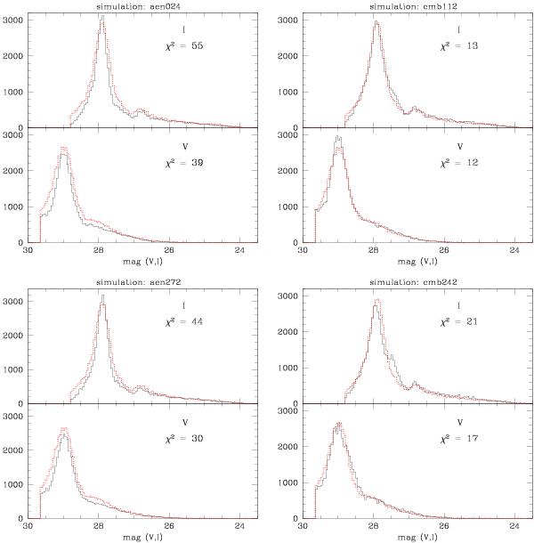
Comparison of the LF fits between the observations (dotted red line) and the simulations (solid black line), where only data above 50% completeness limits are considered. The left panels plot the best fitting LFs for the single age simulation that has 11 Gyr, and the right panels plot the LFs for the best fitting 2-burst simulation that has 80% 12 Gyr population and 20% 2.5 Gyr old population. The top panels are for the comparison with simulations that have input observed MDF, and the bottom panels show simulated LFs with input closed box enrichment. The single age closed box model is shown on the left and the two-burst model composed of input closed box simulations is on the right.
Current usage metrics show cumulative count of Article Views (full-text article views including HTML views, PDF and ePub downloads, according to the available data) and Abstracts Views on Vision4Press platform.
Data correspond to usage on the plateform after 2015. The current usage metrics is available 48-96 hours after online publication and is updated daily on week days.
Initial download of the metrics may take a while.