Fig. 6
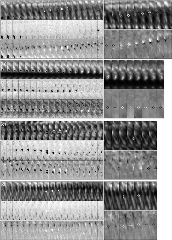
In the left parts, we show the maps of intensities observed with SP analogous to those in Fig. 1c. The white contours mark the discussed downflow patches and the black contours mark the nearby upflow regions, i.e., not all velocity structures are marked by the contours. In the right parts, we show the maps of intensities of the same regions as scanned by the SP observed by FG. The top maps are the G-band intensities and the lower maps show the running difference of Ca II H images, i.e., the changes in the intensities of the chromosphere. The white crosses show the position of the downflow patch during its occurrence and the black crosses show its position before and after its lifetime. The four shown cases are discussed in the text.
Current usage metrics show cumulative count of Article Views (full-text article views including HTML views, PDF and ePub downloads, according to the available data) and Abstracts Views on Vision4Press platform.
Data correspond to usage on the plateform after 2015. The current usage metrics is available 48-96 hours after online publication and is updated daily on week days.
Initial download of the metrics may take a while.