Fig. A.1
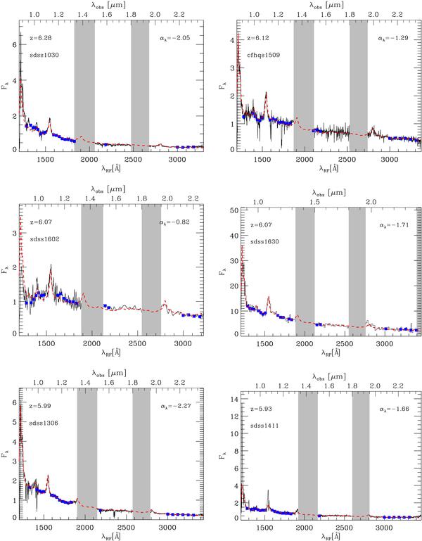
Unreddened quasar spectra. The observed/rebinned spectra are indicated by black lines/filled blue squares, while the red dashed lines represent the best fitting spectra resulting from the χ2 analysis. The gray bands report regions of bad atmospheric transmission. In each panel, the name and the redshift of the quasar is shown at the top left, while the best fitting slope is reported at the top right.
Current usage metrics show cumulative count of Article Views (full-text article views including HTML views, PDF and ePub downloads, according to the available data) and Abstracts Views on Vision4Press platform.
Data correspond to usage on the plateform after 2015. The current usage metrics is available 48-96 hours after online publication and is updated daily on week days.
Initial download of the metrics may take a while.