![\begin{figure}
\par\resizebox{8.8cm}{!}{\includegraphics[width=9cm]{7959fig1.ps}}
\end{figure}](/articles/aa/full/2008/03/aa7959-07/img36.gif) |
Figure 1: Left panel: colour-magnitude diagrams in various redshift intervals; the lines represent the best-fit relations for the blue and red populations and the locus of the minimum, the shaded area is the uncertainty on the minimum. Right panel: the histograms of colour distribution projected at MB=-20 along the best-fit correlations, the continuous horizontal lines are the colour separation at this magnitude, and the dash horizontal lines are the loci of the maxima. |
| Open with DEXTER | |
In the text
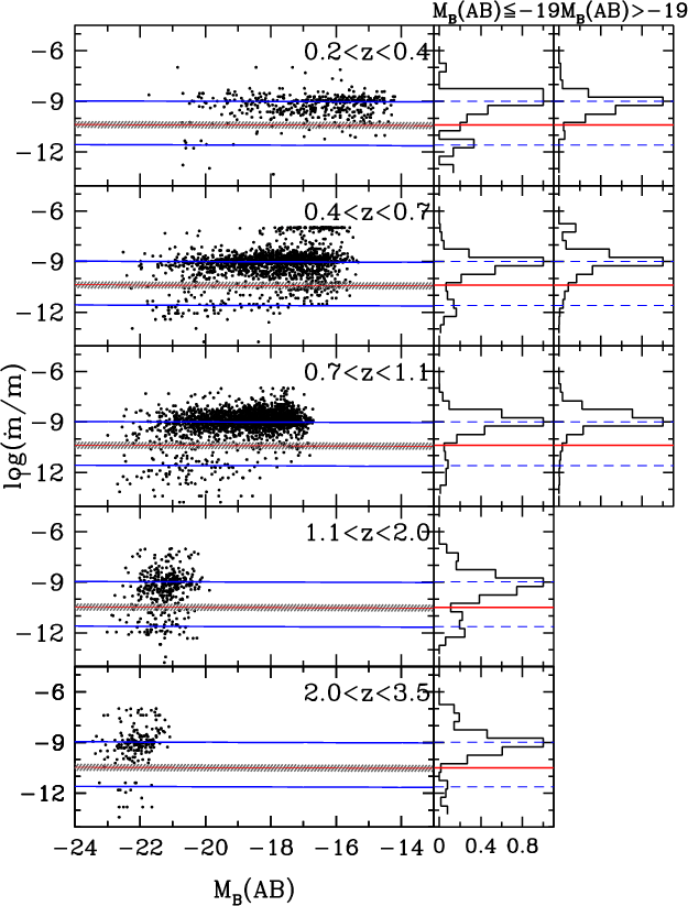 |
Figure 2: As in Fig. 1 but for the SSFR-magnitude distribution. |
| Open with DEXTER | |
In the text
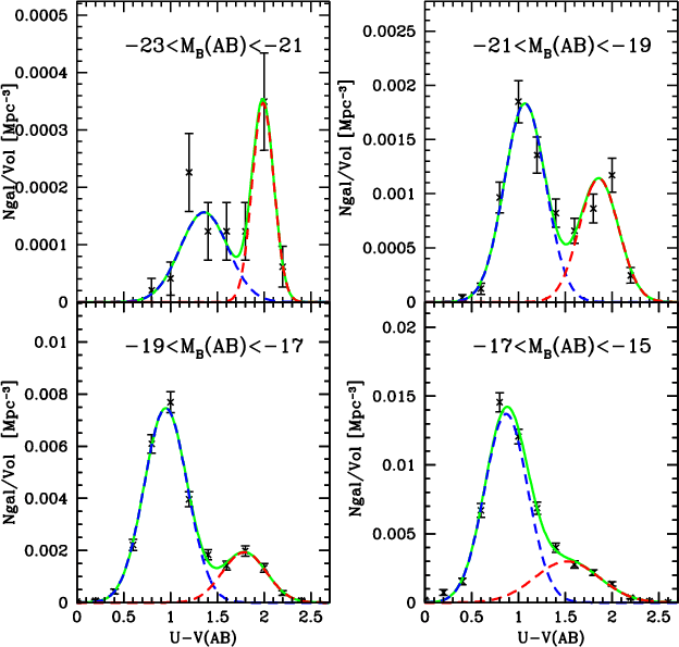 |
Figure 3: Volume corrected colour histogram, in four bins of magnitude, in the redshift interval 0.4<z<0.7. The continuous lines are the double-Gaussian fit to the colour distributions. |
| Open with DEXTER | |
In the text
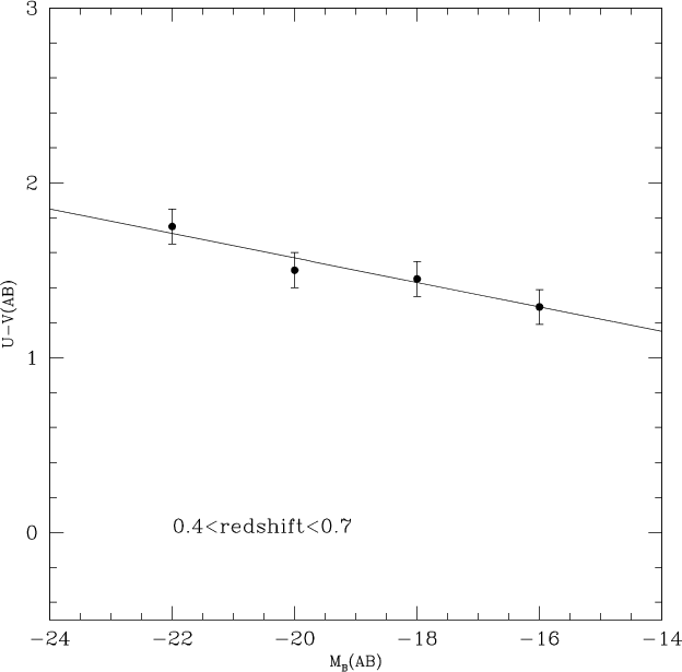 |
Figure 4: Points are the minima obtain by the fits shown in Fig. 3. Continuous line is the linear fit to these minima. |
| Open with DEXTER | |
In the text
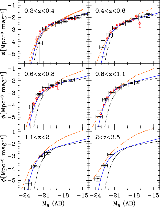 |
Figure 5: Total LF as a function of redshift. The continuous curves come from our maximum likelihood analysis. The dotted line is the local LF (Norberg et al. 2002). The filled circles are the points obtained with 1/VMAX method. The empty circles come from the DEEP2 survey (Willmer et al. 2006). The results from the COMBO17 and VDDS surveys are consistent with the DEEP2 results and are omitted from the plot. The dashed-point line is the model of Menci et al. (2006). |
| Open with DEXTER | |
In the text
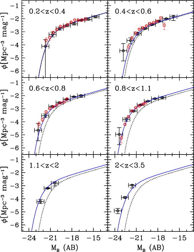 |
Figure 6:
LFs of the
blue galaxies as function of redshift. The continuous curves comes
from our maximum likelihood analysis. The dotted line is our fit at
|
| Open with DEXTER | |
In the text
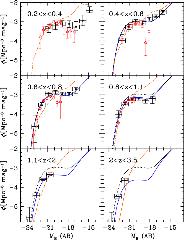 |
Figure 7:
LFs of the
red galaxies as function of redshift. The continuous curves comes
from our maximum likelihood analysis. The first bin of redshift, has been
excluded from this evolutive
analysis since the statistics are too low. The dotted line is our fit at |
| Open with DEXTER | |
In the text
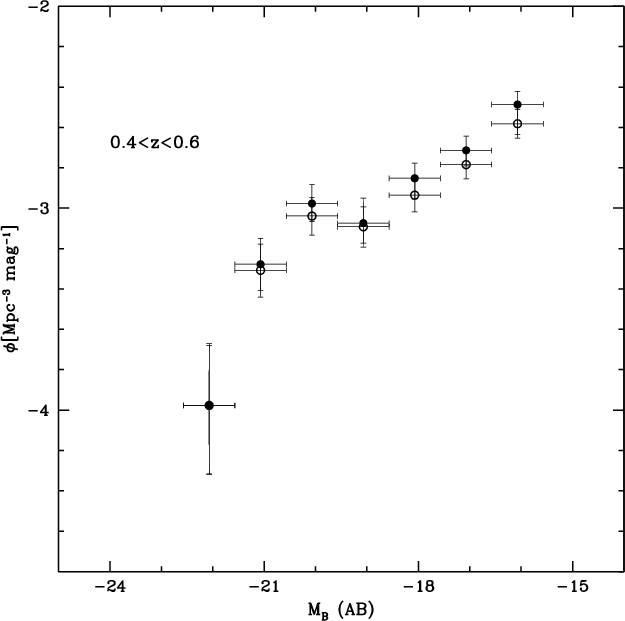 |
Figure 8: LFs of the red galaxies. The filled circles indicate the LF obtained with the linear colour selection in Table 2. The empty circles indicate the LF obtained from the colour histograms in bins of magnitude (see Figs. 3 and 4). |
| Open with DEXTER | |
In the text
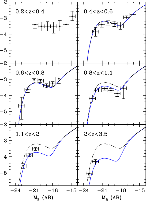 |
Figure 9:
LFs of the
early type galaxies as a function of redshift. The continuous curves
comes from our maximum likelihood analysis. The dotted line is our
fit at |
| Open with DEXTER | |
In the text
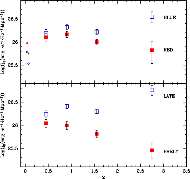 |
Figure 10: Upper panel: galaxy luminosity density for red (filled squares) and blue galaxies (empty squares). Lower panel: the same as the upper panel but for early type galaxies (filled squares) and late type galaxies (empty squares). Small points are the local luminosity density estimates by Madgwick et al. (2002) (z=0.04) and Bell et al. (2003) (z=0.07). |
| Open with DEXTER | |
In the text
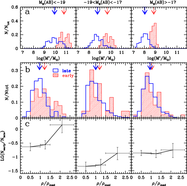 |
Figure 11:
Panel a): stellar mass distribution for the early and late population, the
area of each histogram is normalised to unity. The arrows indicate
the mean value of the stellar mass for the early population (thin
arrow) and for the late population (thick arrow). Panel b): as
for panel a) but for the distribution of
|
| Open with DEXTER | |
In the text