 |
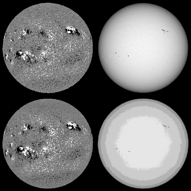
Figure 1: Examples of magnetograms (left) and continuum intensity images (right) for March 19, 1993. The magnetogram and the corresponding continuum intensity image in the upper row were recorded by NSO-SPM, those in the lower row by NSO-512. |
| Open with DEXTER | |
In the text
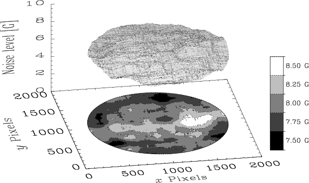 |
Figure 2: Noise level (in G) of the NSO-512 magnetograms as a function of location on the solar disk. Plotted is an average over the noise level surfaces of 6 magnetograms. Both the surface and the contours represent the standard deviation of the magnetogram signal (see text for details). The y-axis gives the direction from south to north, the x-axis from east to west. |
| Open with DEXTER | |
In the text
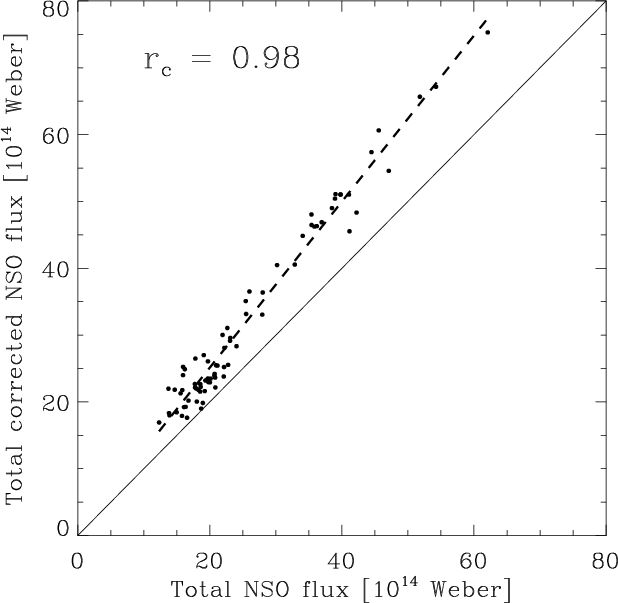 |
Figure 3:
Total (unsigned) photospheric magnetic flux (in 1014 Weber) based on corrected NSO-512 magnetograms vs. total photospheric magnetic flux based on uncorrected NSO-512 magnetograms for several Carrington rotations between 1974 and 1987 (Arge et al. 2002). The correlation coefficient, |
| Open with DEXTER | |
In the text
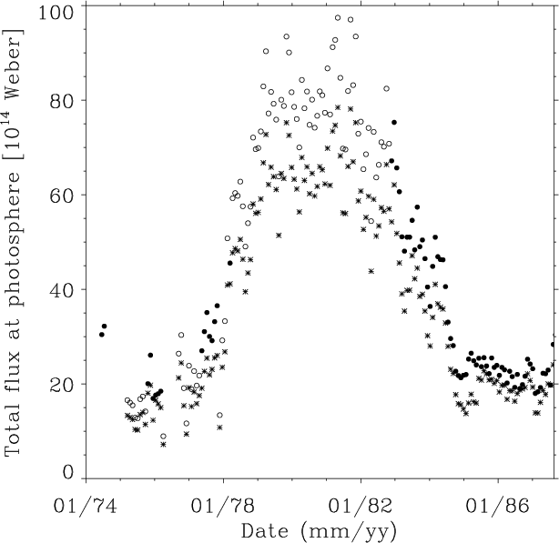 |
Figure 4: Total (unsigned) photospheric magnetic flux for Carrington rotations between 1974 and 1987 based on NSO-512 magnetograms. Asterisks represent uncorrected values, filled circles corrected values obtained by Arge et al. (2002) and open circles represent the linearly scaled NSO-512 flux values (see text for details). |
| Open with DEXTER | |
In the text
![\begin{figure}
\par\includegraphics[width=17cm]{5752fi5.eps} \end{figure}](/articles/aa/full/2006/47/aa5752-06/img34.gif) |
Figure 5: Total (unsigned) photospheric magnetic flux for each Carrington rotation between 1974 and 2002 based on NSO (NSO-512 and NSO-SPM, circles), WSO (plus signs) and MWO (triangles) data (cf. Arge et al. 2002, Fig. 1). See text for details. |
| Open with DEXTER | |
In the text
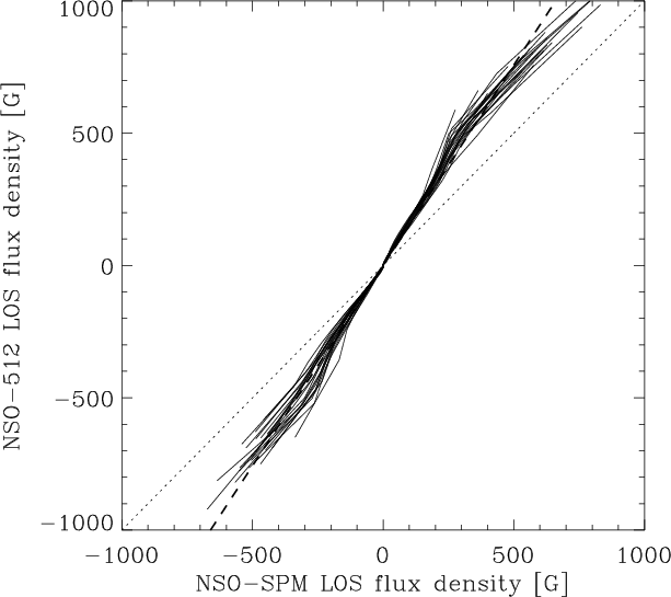 |
Figure 6: Histogram-equating curves for 22 individual days, calculated with NSO-SPM and NSO-512 magnetograms. The dotted diagonal line represents the expectation values for identical NSO-SPM and NSO-512 magnetograms, the dashed line is a linear regression. |
| Open with DEXTER | |
In the text
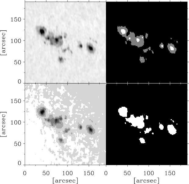 |
Figure 7: Example of a sunspot group in an NSO-SPM continuum intensity image after removal of limb-darkening recorded on March 19, 1993 ( upper left). The same region in the corresponding NSO-512 continuum intensity image ( lower left). Note the jump in the continuum intensity due to the Sun's limb darkening and limited dynamic range of the data close to the location of the sunspots. The upper right frame represents the spot mask obtained from the sunpot region of the NSO-SPM continuum intensity image, the lower right frame from the NSO-512 continuum intensity image. In the NSO-SPM spot mask ( upper right) the umbral area is plotted white, while the penumbral area is grey. Since the NSO-512 continuum intensity images are not good enough to distinguish between umbrae and penumbrae, only entire spots are identified (white) in the NSO-512 spot mask ( lower right). |
| Open with DEXTER | |
In the text
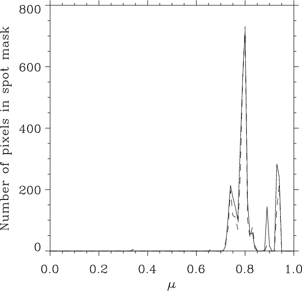 |
Figure 8:
Histogram of the spot mask vs. |
| Open with DEXTER | |
In the text
| |
Figure 9:
a) Sunspot areas in millionths of the solar disk based on NSO-512 data for 1734 days between 1974 and 1992 vs. an independent composite record of sunspot areas. b) The same quantity, but now based on NSO-SPM data for 2055 days between 1992 and 2003 vs. the same independent composite record. The correlation coefficients, |
| Open with DEXTER | |
In the text
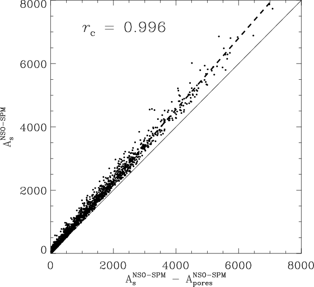 |
Figure 10: Sunspot areas in millionths of the solar disk based on NSO-SPM data for 2055 individual days between 1992 and 2003 vs. the same quantity but now excluding pore areas. |
| Open with DEXTER | |
In the text
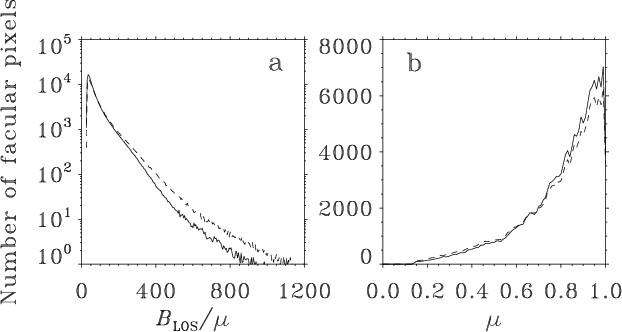 |
Figure 11:
22-day averaged histograms of the facular distributions. a) The number of facular points vs.
|
| Open with DEXTER | |
In the text
| |
Figure 12:
Relative difference,
|
| Open with DEXTER | |
In the text
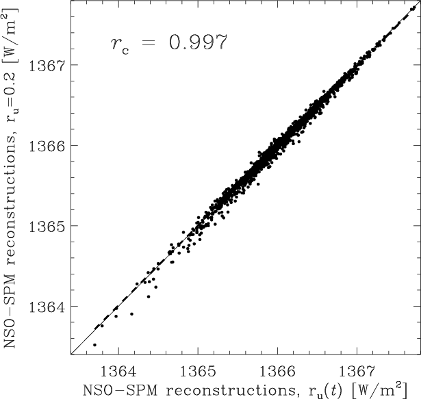 |
Figure 13:
Modelled total solar irradiance based on NSO-SPM data calculated with time independent ratio of umbral to total sunspot area
|
| Open with DEXTER | |
In the text
![\begin{figure}
\par\includegraphics[width=17cm]{5752fi14.eps} \end{figure}](/articles/aa/full/2006/47/aa5752-06/img100.gif) |
Figure 14: PMOD composite record of total solar irradiance (solid line) and reconstructed daily TSI based on NSO-512 data (filled circles, connected by the dotted curve when there are no data gaps) for 1734 days between 1974 and 1992, i.e. from the minimum of cycle 21 to the maximum of cycle 22 (top panel). The middle and lower panels show enlargements of four shorter intervals at different activity levels. The times corresponding to these zoom-ins are marked in the top panel by the double-headed arrows under the roman numerals. |
| Open with DEXTER | |
In the text
![\begin{figure}
\par\includegraphics[width=16.7cm]{5752fi15.eps} \end{figure}](/articles/aa/full/2006/47/aa5752-06/img101.gif) |
Figure 15: The five upper panels show the same as Fig. 14, but now with reconstructed daily TSI based on both NSO-512 and NSO-SPM data between 1974 and 2003. The bottom panel shows the difference between the reconstructed total solar irradiance based on KP (NSO-512 and NSO-SPM) data and the PMOD composite measurements. The solid line indicates difference = 0, the dashed line is a regression. The dotted vertical lines indicate periods, when the individual data sets from HF, AI & AII (ACRIM I & II) and V (VIRGO) were used for the composite. |
| Open with DEXTER | |
In the text
![\begin{figure}
\par\includegraphics[width=8.2cm,clip]{5752fi16.eps} \end{figure}](/articles/aa/full/2006/47/aa5752-06/img107.gif) |
Figure 16:
Modelled total solar irradiance based on KP (NSO-512 and NSO-SPM) data vs. the PMOD TSI composite. The correlation coefficient, |
| Open with DEXTER | |
In the text
| |
Figure 17:
The same as the bottom panel of Fig. 15, but now for the TSI reconstruction with optimized factor between NSO-512 and NSO-SPM
|
| Open with DEXTER | |
In the text
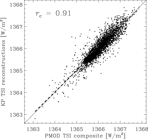 |
Figure 18:
The same as Fig. 16, but now for the TSI reconstruction with optimized factor between NSO-512 and NSO-SPM
|
| Open with DEXTER | |
In the text