 |
Figure 2:
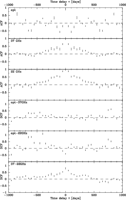
Autocorrelation ( ACF) and cross correlation ( DCF) results for BL Lac. The time lag |
The Discrete Correlation Function (DCF) was introduced by Edelson & Krolik (1988). It was specially developed for correlating unevenly sampled data sets, such as light curves in astronomy. Hufnagel & Bregman (1992) generalized it and used it to correlate optical light curves with radio light curves at frequencies 4.8, 8.0, and 14.5 GHz.
In this paper the form adopted from Hufnagel & Bregman (1992) is used. It goes as follows.
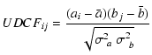
First, the set of unbinned discrete correlations (
UDCFij) are calculated between each pair (ai,bj) in data sets a and b.
UDCFij is defined as
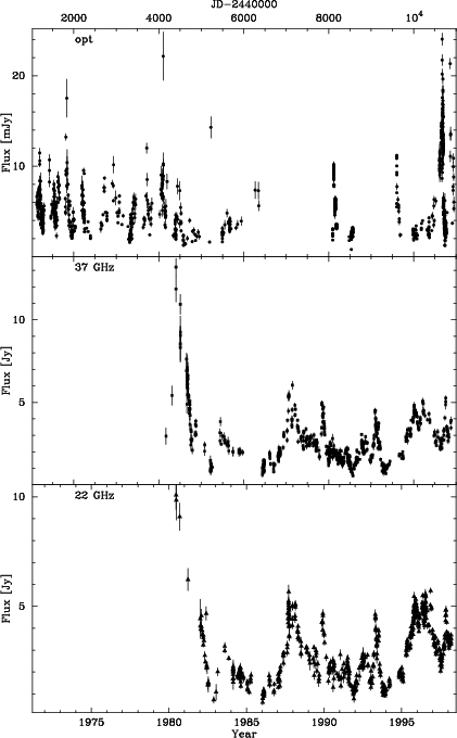
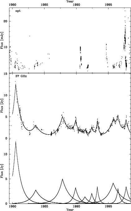
The DCF method is good in the sense that all the data is used and there is no need to interpolate or use artificial data points. This method also gives a reasonable error estimate. It doesn't, however, work well if the data sets are too differently sampled or the bin size in the two light curves to be correlated is very different. Also, if the gaps in the data are long or frequent, the DCF might give wrong correlations. One has to be careful when examining the results, because e.g. the length of a data set or the lenghts of the gaps in data sets may show in the DCF results as positive peaks. The correlations given by the DCF have to be confirmed by other methods, like visual inspection here, before tentatively accepting them as real. As an example of the data, light curves for BL Lac are shown in Fig. 1. The corresponding correlation analysis is shown in Fig. 2.
It has been shown that total flux density (TFD) variations in radio regime can be modelled as a sum of a constant quiescent flux component and a small number of model flare components with exponential rise and decay (Valtaoja et al. 1999). The quiescent flux is caused by the approximately constant background flow in the jet. The outbursts that are modelled with exponential flares are caused by shocks in the jet.
The model flare is of the form:
The TFD decomposition to separate model flares works like CLEAN-algorithm. First, a model flare is fit to the brightest radio flare and substracted from the TFD light curve. This is repeated until there are no significant radio flares left in the light curve. Then the model flare parameters are adjusted by fitting the combined model flares to the real light curve. Of course, a better and better fit can be obtained by adding more and more model flares even to the smallest variations. It is difficult to estimate which variation is a real flare and which is not meaningful. Here this rule of thumb is used: bright flares don't occur more often than approximately once a year, unless it is a double flare. The only exception here is OJ 287. For that source, the outbursts occur more often, especially after 1985. As an example the TFD decomposition for BL Lac is shown in Fig. 3.
The phase of a model flare ![]() is defined as follows:
is defined as follows:
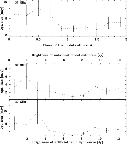
The idea of this method is to replace the real radio light curve with a set of model flares that represent the total flux density variations. Thus small flickering and noise are neglected and only real outbursts are analyzed. Phase and brightness can be defined for a model flare at any epoch. We can therefore connect to each optical data point a set of numbers characterising the concurrent radio status of the source.
At each epoch of optical observation the phase and the brightness of each model radio flare are calculated, along with the total radio brightness calculated by adding the model flares together (see Fig. 3). At each optical observation epoch we take only the brightest two model flares into account. The optical flux is divided between them by linear weighting (i.e., if the first radio flare is at that epoch twice as bright as the next brightest, the optical flux is divided between them at ratio 2:1). The optical flux level is then plotted against the phase and the flux level of the concurrent model radio outburst(s) and against the total flux level of the model light curve. The abscissa is then divided into ten bins. An average of the optical flux is calculated in each bin. The error bars indicate the standard error of the mean in the bin. Thus, having the information of the optical flux against information of all the radio flares in the same figure, we can compare the optical flux levels and the radio status.
For example, if we find that optical flux levels corresponding to the rising part of the radio flare tend to be higher than those on the decaying side, we can say that radio and optical regimes are correlated, even though such a correlation might not show up in the DCF analysis, due to unsufficient data or variable time delays.
Similarly, a comparison of the average optical and radio flare flux levels might reveal a non-random trend indicating a possible correlation in the overall radio and optical behaviour.
An example of such a comparison is shown in Fig. 4.
The first graph shows the dependence of the average optical flux level vs. the phase of the model flare ![]() in the case of BL Lac. It can be seen that the optical flux level tends to be high during the rise of the radio flare and lower during the radio flare decay phase, indicating that the two regimes are connected.
in the case of BL Lac. It can be seen that the optical flux level tends to be high during the rise of the radio flare and lower during the radio flare decay phase, indicating that the two regimes are connected.
The second graph shows the average optical flux level vs. the model radio flare flux level. The third graph shows the average optical flux level vs. total radio flux level calculated by adding model flares to form an model light curve. It is obvious that for BL Lac, high radio flux levels do not coincide with high optical flux levels. On the contrary: the highest optical flux level tends to occur at intermediate or low radio flux levels. One possible explanation for this is that, on the average, optical events tend to precede radio events by a significant amount, as indeed the correlation analysis also indicates.
Copyright ESO 2002
![$\displaystyle \sigma_{DCF}=\frac{1}{\sqrt{(M-1)(M'-1)}} \left\{ \sum{\left[UDCF_{ij}-DCF(\tau )\right ]^2} \right\} ^{1/2}\cdot$](/articles/aa/full/2002/40/aah3628/img28.gif)