Fig. 6
Download original image
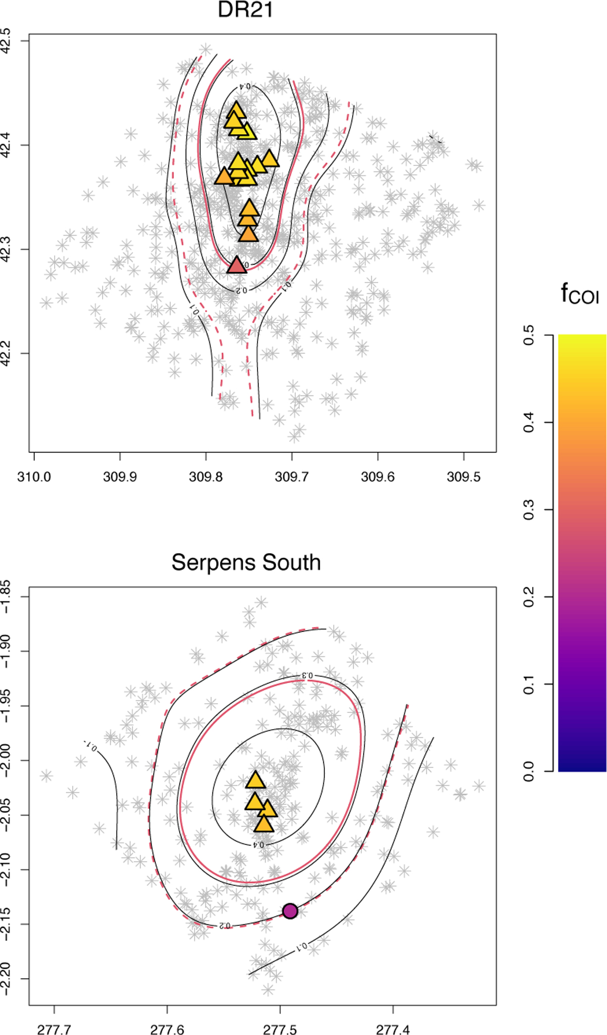
Maps of selected HRA regions with NESTs. Grey dots represent the YSOs in the area, and coloured markers show the position of NESTs. Symbols indicate whether the activity of NESTs is significantly different (triangles for larger and inverted triangles for lower activity) or consistent with the average (circles). The colour-scale shows the ratio of Class 0/I objects assigned to each NEST. Contours show each region’s relative-risk map values, and red contours mark the threshold boundaries, f̄C0/I ± σfC0/I, separating areas with values different from the average control distribution for each region (solid red contour for the upper limit and dashed red contour for the lower limit).
Current usage metrics show cumulative count of Article Views (full-text article views including HTML views, PDF and ePub downloads, according to the available data) and Abstracts Views on Vision4Press platform.
Data correspond to usage on the plateform after 2015. The current usage metrics is available 48-96 hours after online publication and is updated daily on week days.
Initial download of the metrics may take a while.