Fig. 1
Download original image
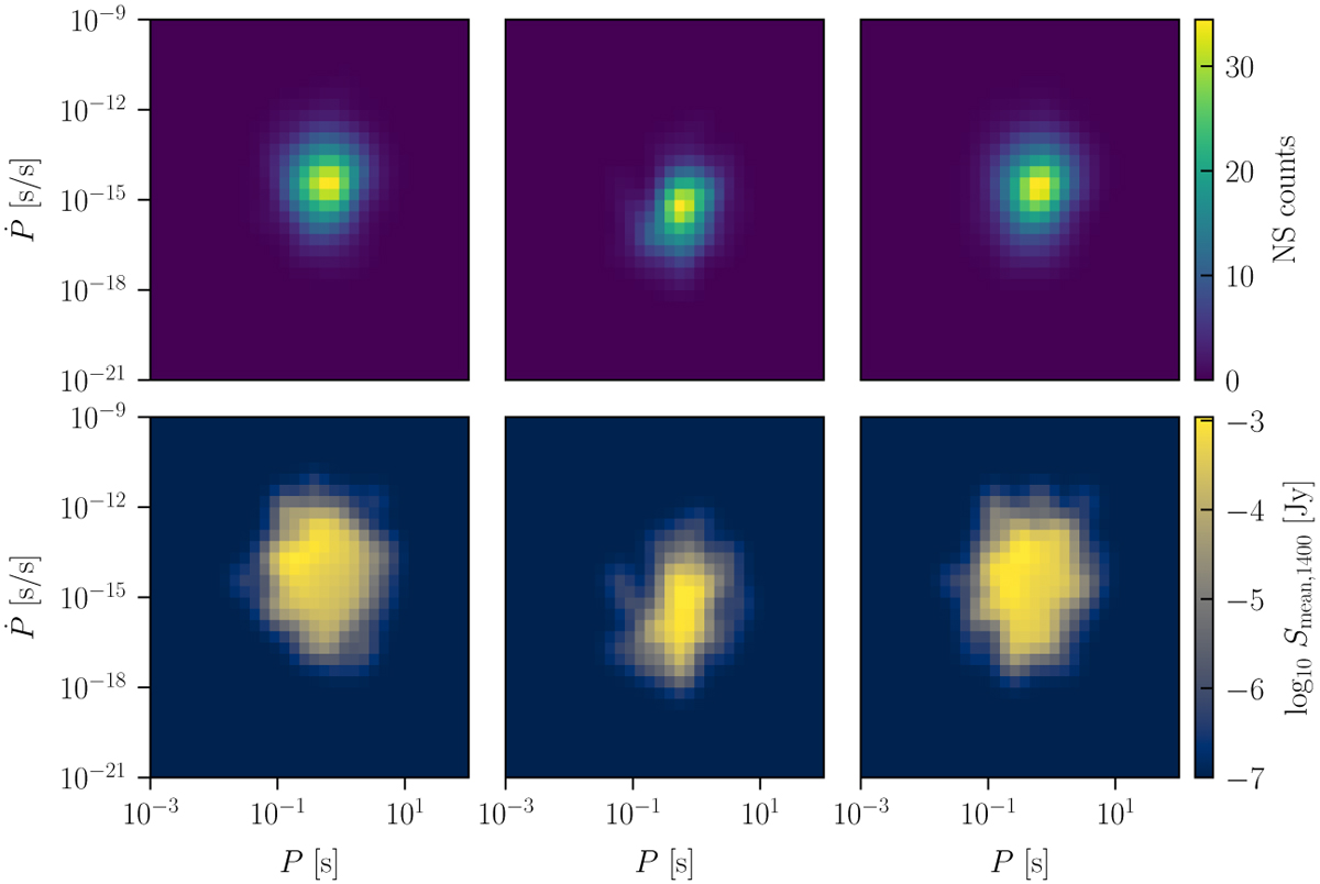
Example of the six density maps for a random simulated neutron star population, which we fed into the SBI pipeline. The top and the bottom row show the P-Ṗ diagrams and the P-Ṗ averaged flux maps for each of the three surveys, respectively. In the top row, the colour represents the density in neutron star number within each bin, while in the bottom row the colour represents the averaged flux in Jy within each bin. For bins without any stars in the bottom row, the average flux has been set to −7.
Current usage metrics show cumulative count of Article Views (full-text article views including HTML views, PDF and ePub downloads, according to the available data) and Abstracts Views on Vision4Press platform.
Data correspond to usage on the plateform after 2015. The current usage metrics is available 48-96 hours after online publication and is updated daily on week days.
Initial download of the metrics may take a while.