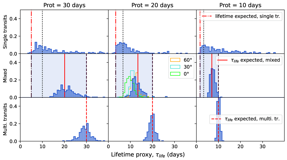
Fig. 4.
Download original image
Normalised histograms of τlife. Each column corresponds to a different rotation period, and each row to a type of lifetime (single-transit, multi-transit and mixed spots). Here, only the results for the new model are shown, since it cannot be retrieved using the Harvey model. For each panel, the red lines show the expected value. The vertical black dash-dotted line represents the lifetime value for the single-transit spots and the dashed the one for the spots that last several transits (i.e. τlife = 1Prot). In the case of mixed spots, these two lines are represented, as they show the range of possible values. This space has been coloured in blue for clarity. The full line represent the mean value of the lifetimes. For single-transit and mixed-spots simulations, the vertical black dotted line represents the value of lifetime where two transits are visible in the LC. The stepped histograms in green, blue and orange correspond to the simulations where the inclination of the rotation axis varies (respectively to 0, 30 and 60 degrees).
Current usage metrics show cumulative count of Article Views (full-text article views including HTML views, PDF and ePub downloads, according to the available data) and Abstracts Views on Vision4Press platform.
Data correspond to usage on the plateform after 2015. The current usage metrics is available 48-96 hours after online publication and is updated daily on week days.
Initial download of the metrics may take a while.