Fig. 7
Download original image
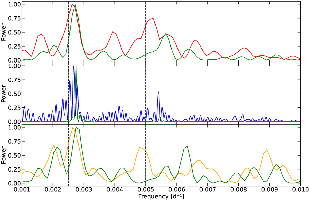
Spectroscopy vs. Photometry periodograms. Upper panel: Lomb–Scargle periodogram of the mean intensity profile presented in Fig. 1 (red line). Middle panel: periodogram of the light curve since 1990 as retrived from the AAVSO database (blue line). Lower panel: periodogram of the light curve (orange line) from AAVSO when the dates correspond to the TBL observations. In every panel, the green line marks the associated window function. The 400 d and the 200 d periods are marked by the black dashed lines.
Current usage metrics show cumulative count of Article Views (full-text article views including HTML views, PDF and ePub downloads, according to the available data) and Abstracts Views on Vision4Press platform.
Data correspond to usage on the plateform after 2015. The current usage metrics is available 48-96 hours after online publication and is updated daily on week days.
Initial download of the metrics may take a while.