Fig. 2.
Download original image
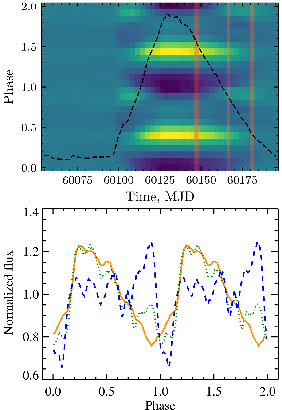
Evolution of the pulse profiles during the outburst. Top: color-coded pulse profiles as observed by Fermi/GBM in units of relative intensities (see Appendix A.2 in Wilson-Hodge et al. 2018); yellow corresponds to the maxima of the pulse and dark blue to the minima. The black dashed line shows the evolution of the pulsed flux in the 12–50 keV range during the outburst as seen by Fermi/GBM (https://gammaray.nsstc.nasa.gov/gbm/science/pulsars/lightcurves/swiftj0243.html) with the peak flux being 4.8 × 10⁻⁹ erg cm−2 s−1. The shaded vertical stripes mark the times of IXPE observations. Bottom: normalized pulse profiles in the 2–8 keV band as observed by IXPE in three observations and shown with the solid orange, dotted green, and dashed blue lines for Obs. 1, 2, and 3, respectively.
Current usage metrics show cumulative count of Article Views (full-text article views including HTML views, PDF and ePub downloads, according to the available data) and Abstracts Views on Vision4Press platform.
Data correspond to usage on the plateform after 2015. The current usage metrics is available 48-96 hours after online publication and is updated daily on week days.
Initial download of the metrics may take a while.