Open Access
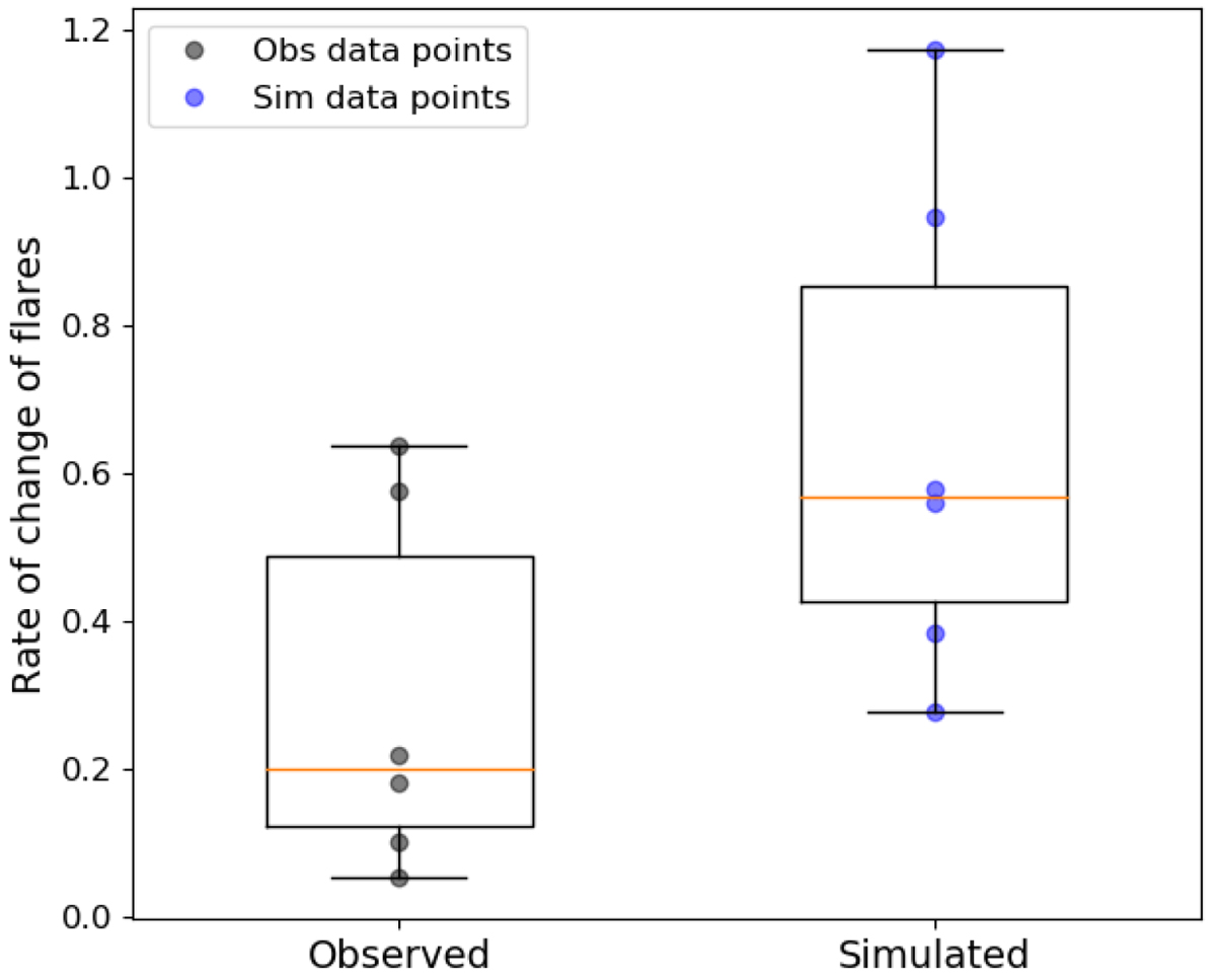
Fig. 11.
Download original image
Example of a boxplot showing the range of the rate of change values for the observed and the simulated data. The box represents the IQR, the orange line inside the box is the median, and the whiskers show the spread of the data. Overplotted are also the actual values in black and blue.
Current usage metrics show cumulative count of Article Views (full-text article views including HTML views, PDF and ePub downloads, according to the available data) and Abstracts Views on Vision4Press platform.
Data correspond to usage on the plateform after 2015. The current usage metrics is available 48-96 hours after online publication and is updated daily on week days.
Initial download of the metrics may take a while.