Fig. 3.
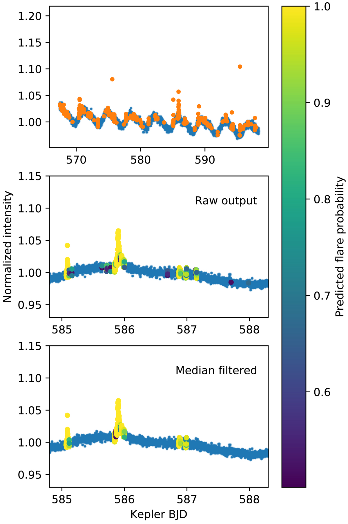
Example output from the validation data set (KIC 012156549). The top panel shows the input light curve (blue points) with all the data points marked by the neural network as flares (orange points). The middle panel is zoomed in, with the color code showing the raw output from the predictions where the output probability is higher than 0.5. There are a few points within flares that are not marked (false negatives), and some single points that are incorrectly identified as flares (false positives). This can be rectified by smoothing the output probabilities by a median filter (bottom plot panel).
Current usage metrics show cumulative count of Article Views (full-text article views including HTML views, PDF and ePub downloads, according to the available data) and Abstracts Views on Vision4Press platform.
Data correspond to usage on the plateform after 2015. The current usage metrics is available 48-96 hours after online publication and is updated daily on week days.
Initial download of the metrics may take a while.