Fig. 9
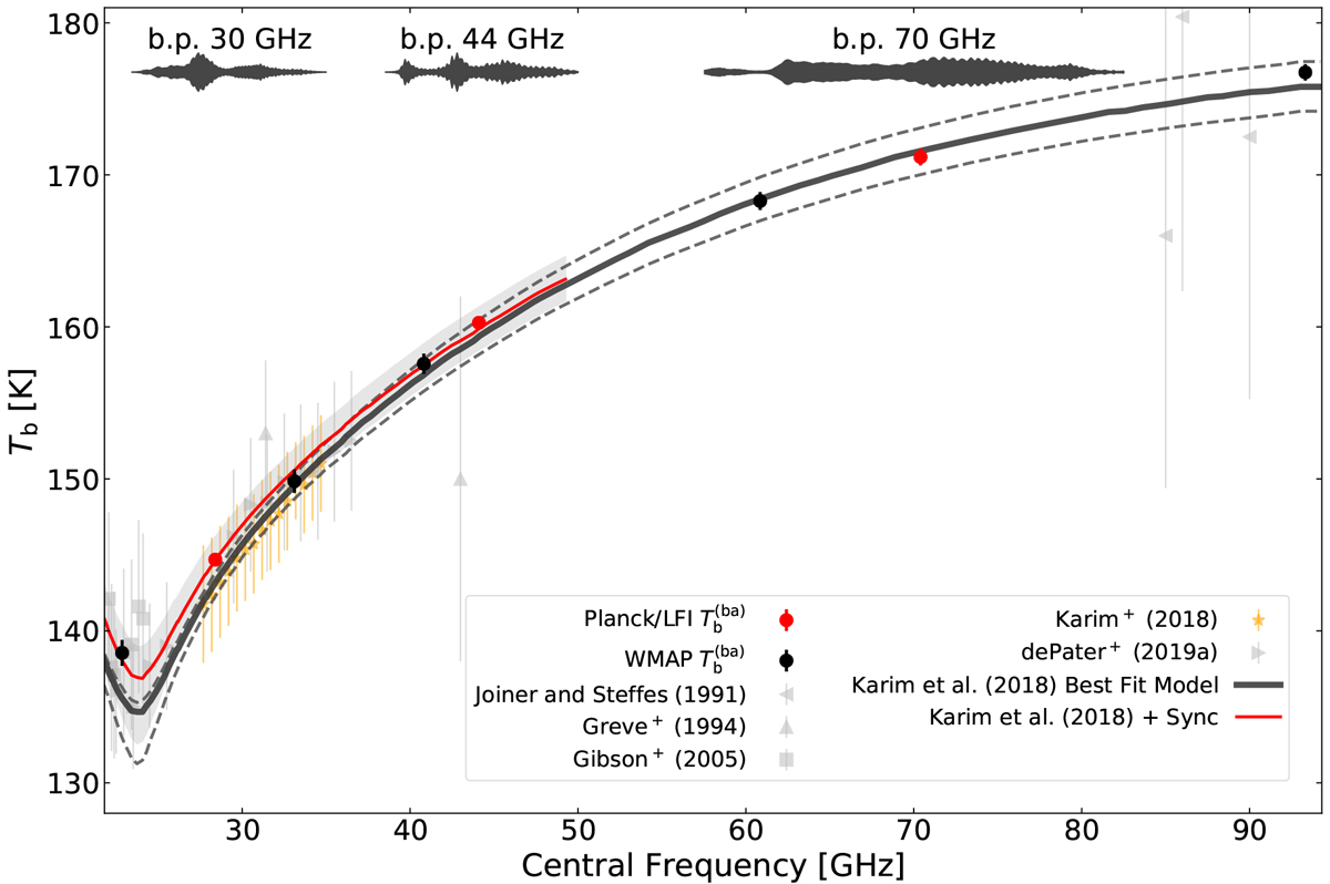
Comparison of Jupiter measurements made in this paper (red circles) with WMAP (black points, taken from Weiland et al. (2011); Bennett et al. (2013) and converted to
![]() ) and with measurements from literature and the RT model by Karim et al. (2018). The model brightness temperature
) and with measurements from literature and the RT model by Karim et al. (2018). The model brightness temperature
![]() is plotted as a dark grey line. The top and bottom dashed lines represent the upper and lower limits of model uncertainties as provided in the same paper. The RT model plus the synchrotron emission correction is plotted as a red line; the grey band represents the lower and upper limits. For references of ground-based measurements, see the text. The brightness temperatures reported by Gibson et al. (2005) are recalibrated measures originally published by Klein & Gulkis (1978). The violin plots at the top of the figure represent the relative sensitivity to the frequencies inside each bandpass.
is plotted as a dark grey line. The top and bottom dashed lines represent the upper and lower limits of model uncertainties as provided in the same paper. The RT model plus the synchrotron emission correction is plotted as a red line; the grey band represents the lower and upper limits. For references of ground-based measurements, see the text. The brightness temperatures reported by Gibson et al. (2005) are recalibrated measures originally published by Klein & Gulkis (1978). The violin plots at the top of the figure represent the relative sensitivity to the frequencies inside each bandpass.
Current usage metrics show cumulative count of Article Views (full-text article views including HTML views, PDF and ePub downloads, according to the available data) and Abstracts Views on Vision4Press platform.
Data correspond to usage on the plateform after 2015. The current usage metrics is available 48-96 hours after online publication and is updated daily on week days.
Initial download of the metrics may take a while.