Fig. A.1
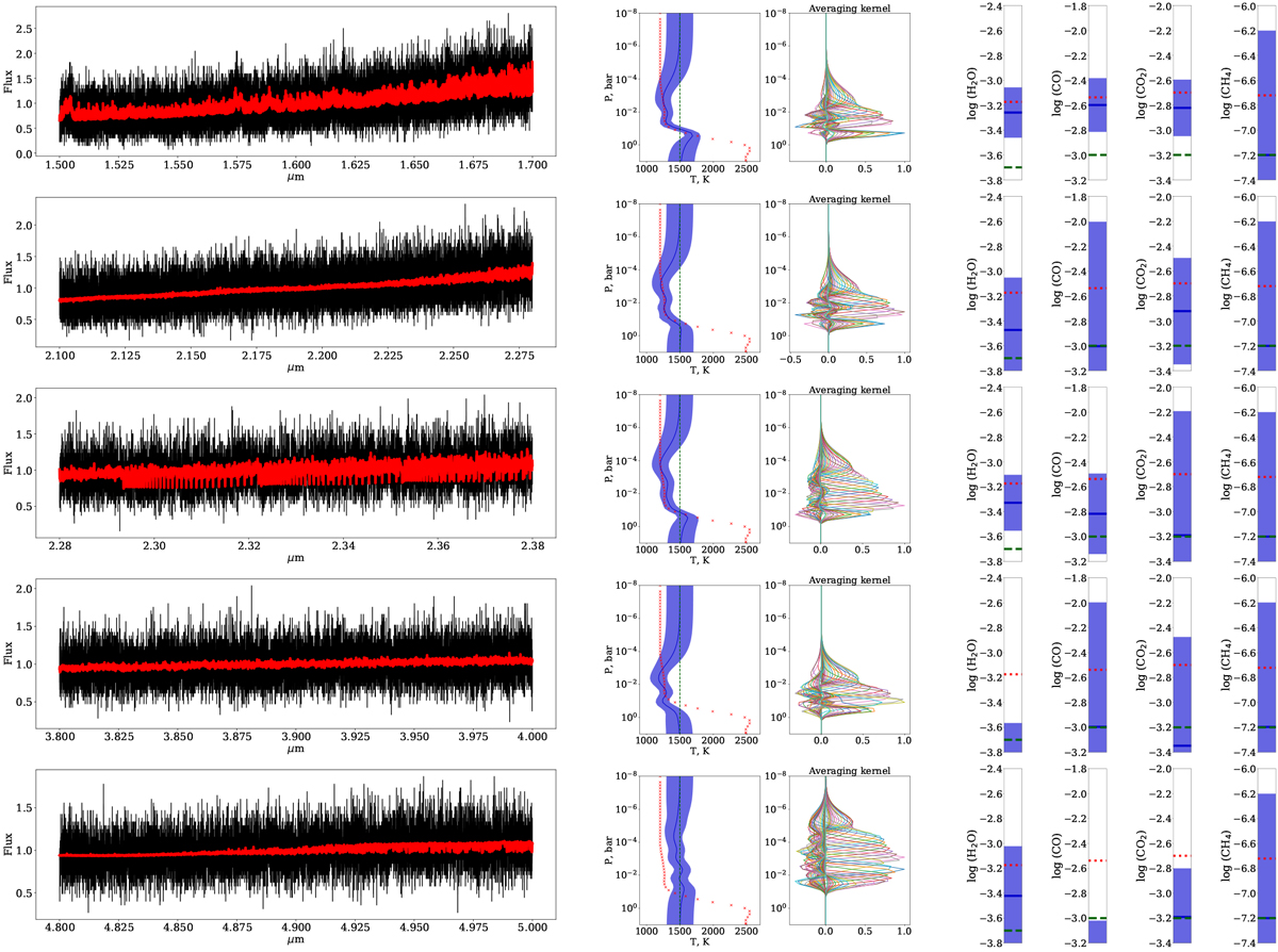
Retrieved temperature and mixing ratios from five spectral regions at spectral resolution R = 100 000 and S/N = 5. In each panel the first plot is the temperature distribution as a function of atmospheric pressure (solid blue line) and with error bars shown as shaded area. The red crosses and green dashed line are the true solution and initial guess, respectively. The second plot shows averaging kernels derived for the temperature distribution. Here averaging kernels for different atmospheric depths are randomly color-coded for better representation. The next four plots are the values of the retrieved mixing ratios of four molecular species (color-coded as in the first plot). The mixing ratios were assumed to be constant with atmospheric depth, and we show their values on the y-axis. The last plot compares the best fit predicted spectrum (solid red line) with the observed one (black circles).
Current usage metrics show cumulative count of Article Views (full-text article views including HTML views, PDF and ePub downloads, according to the available data) and Abstracts Views on Vision4Press platform.
Data correspond to usage on the plateform after 2015. The current usage metrics is available 48-96 hours after online publication and is updated daily on week days.
Initial download of the metrics may take a while.