Fig. 3
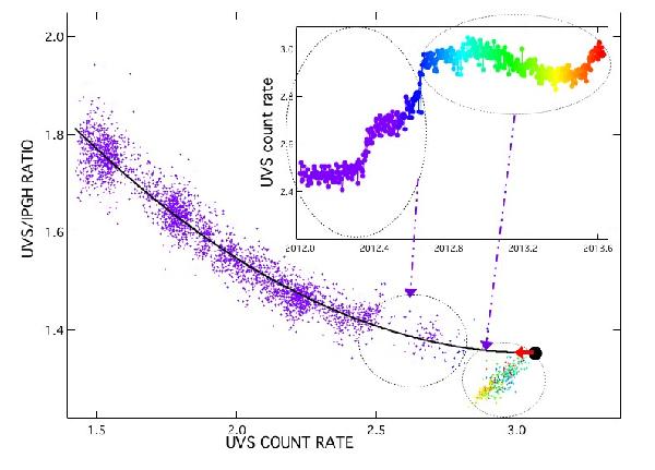
The main curve shows the UVS-IPGH ratio, this time as a function of the UVS signal. All time periods are now merged to form a smooth decreasing curve that prevails until the latest intensity jumps. Its slope (absolute value) is also decreasing and the flattening is already pronounced in 2012. The large black dot corresponds to the extrapolated minimum of this differential demodulation curve, fitted by a third order polynomial and based on data prior to 2012.6 (in violet). It shows that the ratio achieved in 2012.6 is very close to this extrapolated minimum. The inset shows UVS measurements from May 2012. The color scale marks the time since 2012.5, and allows to find the corresponding data points in the main curve. From this main curve it is clear that after the second jump the UVS/IPGH ratio now significantly departs from the global trend that was prevailing since 1992. The small fluctuations of the UVS signal since Sept 2012 (inset) correspond to UVS-IPGH varying ratios going up and down around an average value, that can be also followed in the main curve. As will be demonstrated using data from the LECP instrument, this behavior is linked to post-jump varying anisotropies of the proton distribution.
Current usage metrics show cumulative count of Article Views (full-text article views including HTML views, PDF and ePub downloads, according to the available data) and Abstracts Views on Vision4Press platform.
Data correspond to usage on the plateform after 2015. The current usage metrics is available 48-96 hours after online publication and is updated daily on week days.
Initial download of the metrics may take a while.