 |
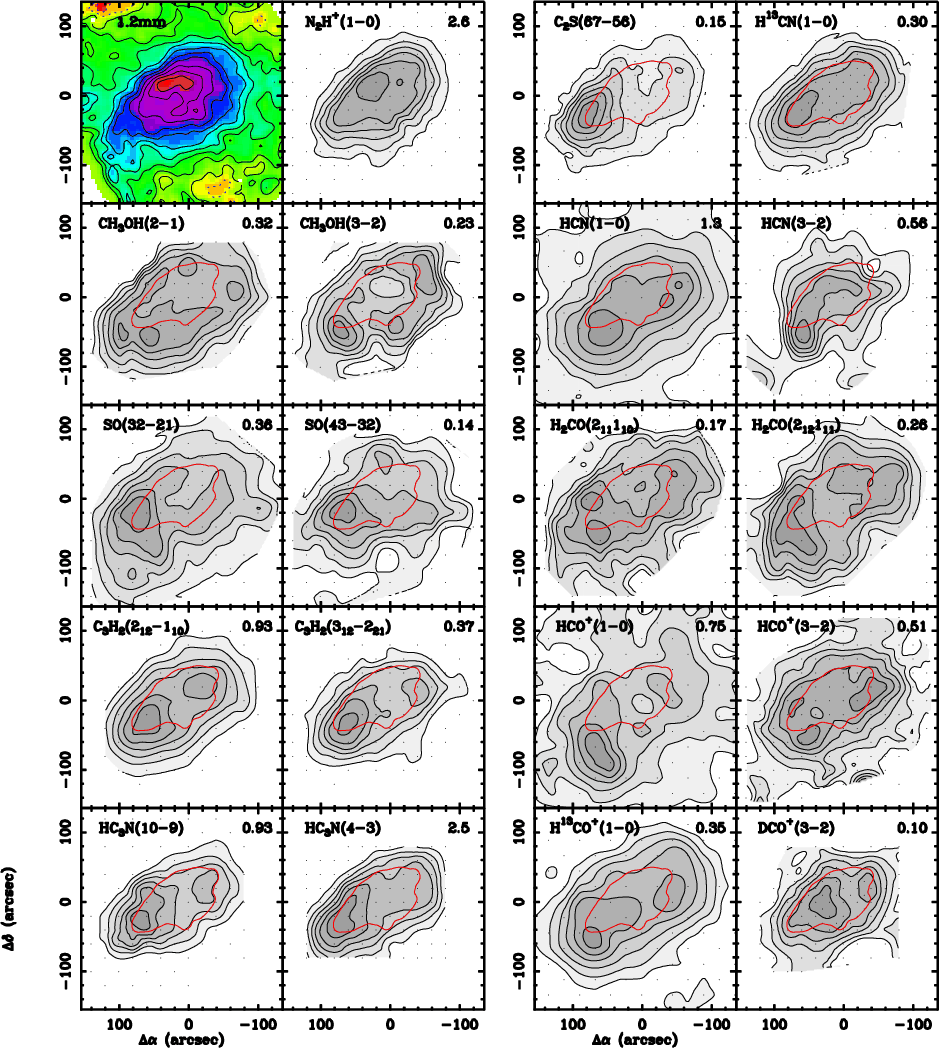
Figure 1:
Integrated intensity maps from our molecular survey
of L1498. The two top left panels show the 1.2 mm
continuum and N2H+(1-0) data presented in Paper I.
In contrast with these centrally concentrated distributions,
the other molecular-line
maps are ring-like or centrally-depressed, and have relative
minima at the 1.2 mm/N2H+ peak. This is an indication
of a central drop in the abundance of most species (see
text). Both IRAM 30 m and FCRAO maps
have been convolved with a Gaussian beam of 20-30 arcsec
to filter out high-frequency noise, and for all lines, the
contours are at 15, 30, ... percent of the peak intensity
(peak intensity in K km s-1 is indicated on the top right corner of
each panel). To better compare the survey line maps with the
N2H+(1-0) emission, the contour at 75% of the peak
is superimposed in red.
The dots indicate the original map sampling.
Central coordinates are
|
| Open with DEXTER | |
In the text
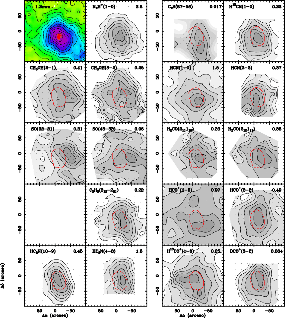 |
Figure 2:
Same as Fig. 1 but for the L1517B core.
Central coordinates are
|
| Open with DEXTER | |
In the text
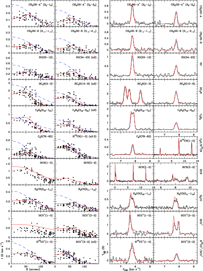 |
Figure 3:
Radial profiles of integrated intensity and central
spectra for all line data observed toward L1498. The squares
in the radial profiles and the histograms in the spectra
are observed data while the lines represent Monte Carlo model
results. The blue dashed lines are models that assume a
constant abundance chosen to fit the data at a relatively
large fiducial radius (see text), and the red solid lines are
the prediction from the best fit model. Note how the constant
abundance models over predict the central intensity typically
by a factor of 2 or more.
The integrated intensities in the radial profiles ( left panels) have
a typical 1- |
| Open with DEXTER | |
In the text
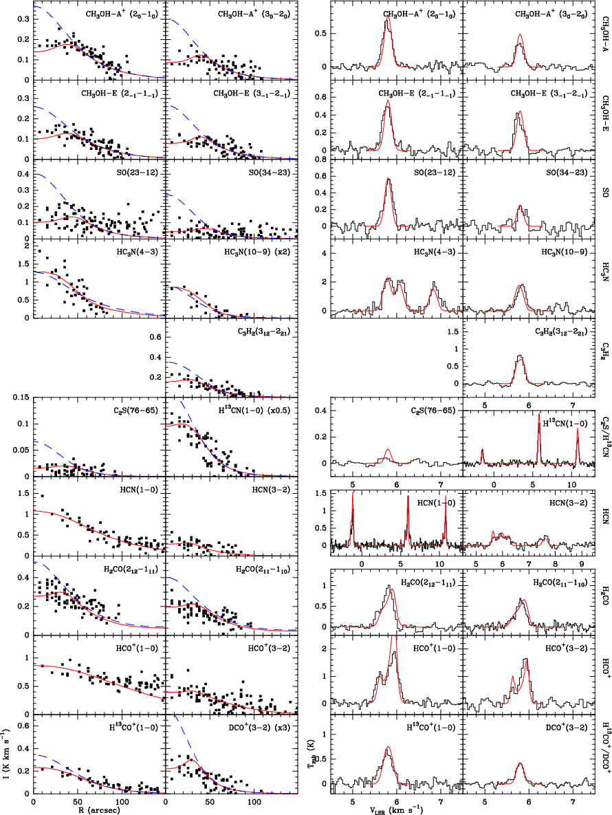 |
Figure 4: Same as Fig. 3 but for the L1517B core. |
| Open with DEXTER | |
In the text
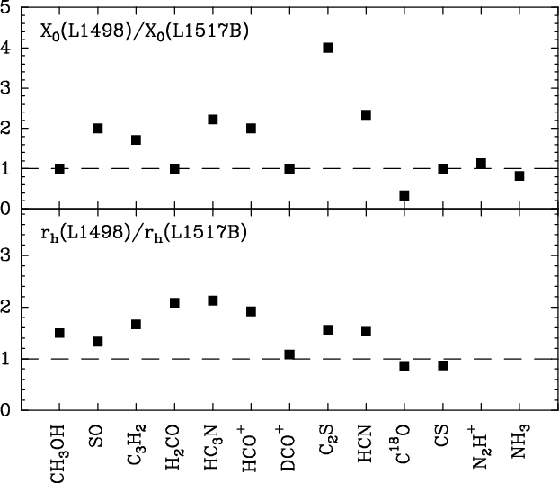 |
Figure 5:
Abundance comparison between L1498 and L1517B. Top:
ratio between the abundances outside the central hole
(X0) in the two cores
(for HC3N and C3H2, X0 is the abundance between the
hole and the outer cutoff). For most species, this ratio
is close to 1 (within a factor of 2), indicating a similar
pre-freeze out composition. Bottom: ratio between
central depletion holes ( |
| Open with DEXTER | |
In the text
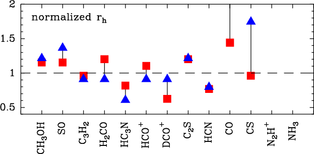 |
Figure 6:
Normalized radius of the abundance hole |
| Open with DEXTER | |
In the text
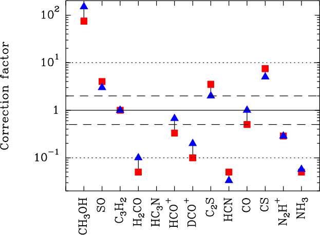 |
Figure 7:
Correction factors needed to make the abundances
predicted by
the Aikawa et al. (2005)
|
| Open with DEXTER | |
In the text
| |
Figure 8: Comparison between the concentration ratios predicted by the Aikawa et al. (2005) model and the observations of L1498 (red squares) and L1517B (blue triangles). A value equal to 1 indicates that the model predicts emission with the same central concentration as observed, a value larger than 1 indicates that the model is more concentrated than the data (small central hole), and a value less than 1 indicates a model prediction flatter than the data (too large a hole). There is an overall (factor of 2) agreement between model and data, although the L1517B data seems systematically lower than 1. The model therefore overestimates the central hole seen in L1517B. |
| Open with DEXTER | |
In the text
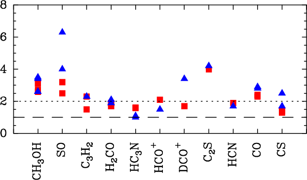 |
Figure 9: Effect of depletion on the different lines and transitions observed in the survey. The y-axis represents the ratio between the central intensities of a constant abundance model and the best fit model for each of the lines observed in L1498 (red squares) and L1517B (blue triangles). Large values indicate a strong effect of the central depletion in the emission from the core center. |
| Open with DEXTER | |
In the text
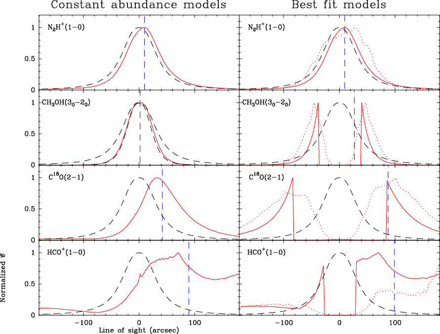 |
Figure 10: Normalized contribution functions of representative species in L1517B (the observer is at large radius, i.e., to the far right of each panel). The red solid and dotted lines are the contribution functions, while the black dashed lines indicate the normalized density profile shown for reference (the normalized square of the density profile is also shown for CH3OH). In the best fit models ( right column), the solid line corresponds to our simple abundance step function, while the dotted lines are the contribution functions expected for the abundance profiles predicted by the Aikawa et al. (2005) models (scaled appropriately to fit the L1517B data). In each panel, the vertical dashed lines indicates the radius at which half of the total emission is reached. Note how in the moderately thick C18O(2-1) and extremely thick HCO+(1-0) lines most of the emission arises from the front outer layer of the core. |
| Open with DEXTER | |
In the text
In the text
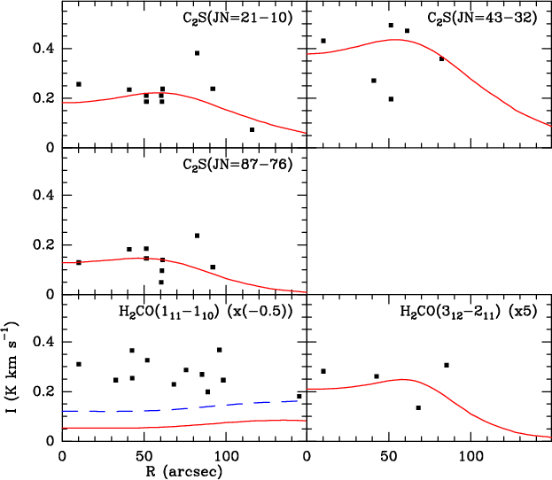 |
Figure C.1: Comparison of L1498 data taken from the literature (solid squares) with the predictions of the best fit model of Sect. 4.2 (red lines). The top three panels show that the model fits well the C2S radial profiles generated from the data of Wolkovitch et al. (1997). The bottom two panels show that the model fits well the H2CO(312-211) line of Young et al. (2004), but fails to fit the H2CO(111-110) line (from the same authors), which appears in absorption against the cosmic background. To illustrate the sensitivity of the 111-110 absorption to the core low density gas, a model with a backside envelope is shown in blue dashed lines (see text). |
In the text