 |
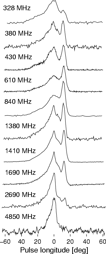
Figure 1: Long term average profiles of J1022+1001 at various radio frequencies. Profiles at 328, 382, 840 and 1380 MHz are from our present observations. All the other profiles have been taken from Kramer et al. (1999b) and references therein. Bandwidths of these observations are (from 328 MHz to 4850 MHz) 10, 10, 10, 10, 80, 80, 40, 40, 80 and 112 MHz, respectively. |
| Open with DEXTER | |
In the text
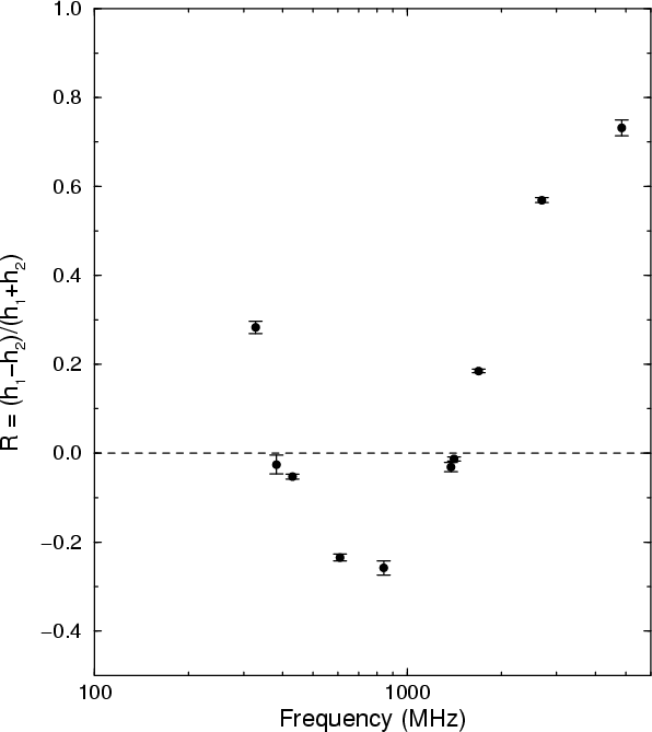 |
Figure 2:
Normalised component amplitude ratio R as a function of
radio frequency. A value of |
| Open with DEXTER | |
In the text
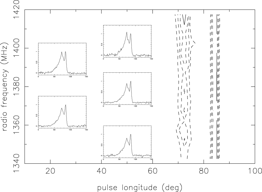 |
Figure 3:
Contour plot of pulse intensity as a function of pulse
longitude and observing frequency for an average pulse profile
constructed with 8 min of time series (approximately 30 000 pulses)
in all the 16 channels each of 5 MHz width. For clarity, height of the
second component ( |
| Open with DEXTER | |
In the text
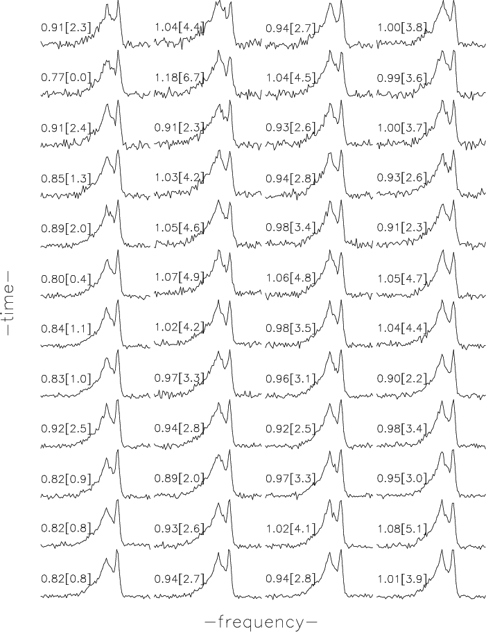 |
Figure 4:
Average pulse profiles as a function of time in four
different frequency channels. Each average profile was created with 8 min of time series. The four columns correspond to frequency
channels with centre frequencies of 1382.5, 1407.5, 1412.5 and 1417.5
MHz, respectively, with a channel width of 5 MHz. The fractional
height of the first component (
|
| Open with DEXTER | |
In the text
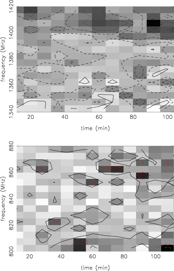 |
Figure 5: Component amplitude ratio as a function of time (X-axis) and radio frequency (Y-axis). Each point corresponds to a time length of 8 min. Top panel corresponds to the observation at 1380 MHz, and the bottom panel to 840 MHz. Contour levels, in steps of root mean square error (see Eq. (1)), are indicated with different line styles for clarity. In the top panel, from the lowest contour level (white colour), the line style goes as "solid'', "dash'', "dot-dash'', "dot-dot-dash'', "dotted'', and "solid''. The highest contour level corresponds to the darkest gray scale point. In the bottom panel, as the signal to noise ratio is not as high as that of the top panel, there are only three significant contour levels. |
| Open with DEXTER | |
In the text
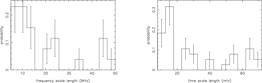 |
Figure 6: Distribution of frequency and time scale lengths. Only the data set at 1380 MHz was used for this plot. As the plots show, a range of frequency and time scales are seen. |
| Open with DEXTER | |
In the text
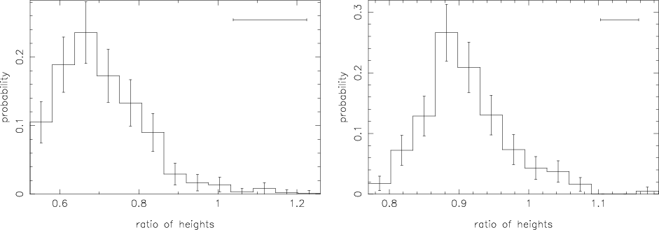 |
Figure 7:
Distribution of height ratios of the two components
observed at 840 MHz (left) and 1380 MHz (right), for each 8 min average profile in each 5 MHz frequency channel. Horizontal error
bar in the top right corner indicates 1 |
| Open with DEXTER | |
In the text
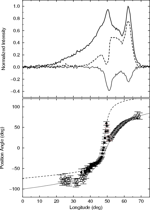 |
Figure 8: Top panel gives the average pulse profile of PSR J1022+1001 at 1420 MHz (solid line), the average linearly polarised intensity (dashed line), and the average circularly polarised intensity (dotted line). The bottom panel shows the position angle of the linearly polarised emission component as a function of pulse longitude. See text for details. |
| Open with DEXTER | |
In the text
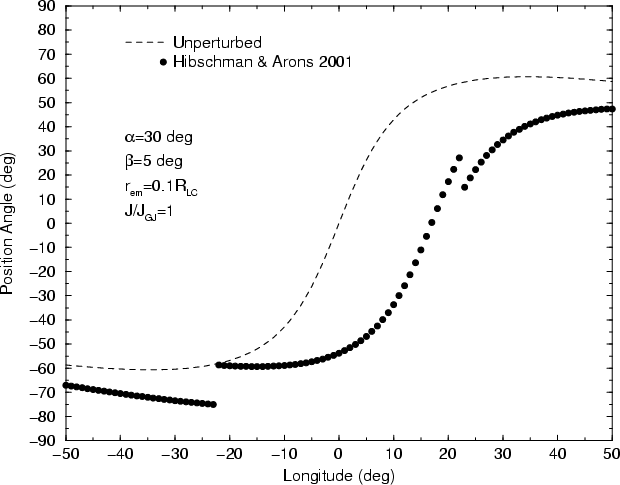 |
Figure 9:
Linear polarisation position angle as a function of pulse
longitude. "Dash'' line shows the unperturbed curve, and the dotted
line shows the curve after taking into account the effect of
aberration and magnetospheric return currents.
|
| Open with DEXTER | |
In the text